
Visual direction
Case 03: Companion Visuals
A quiet look :
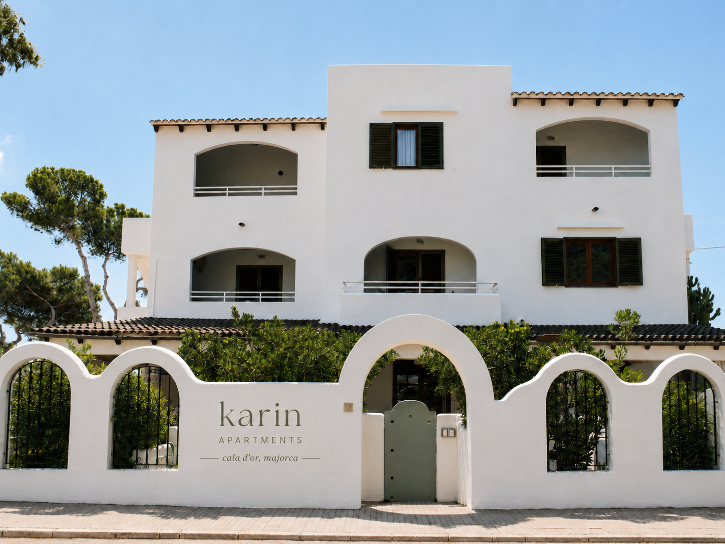
Karin Apartments.
Alongside the listing intelligence audit, we developed a light visual identity and reshot the property: a small collection of images and print pieces that translate the calm of Cala d'Or into a brand people remember.
Cala d'Or · Mallorca
01: Identity
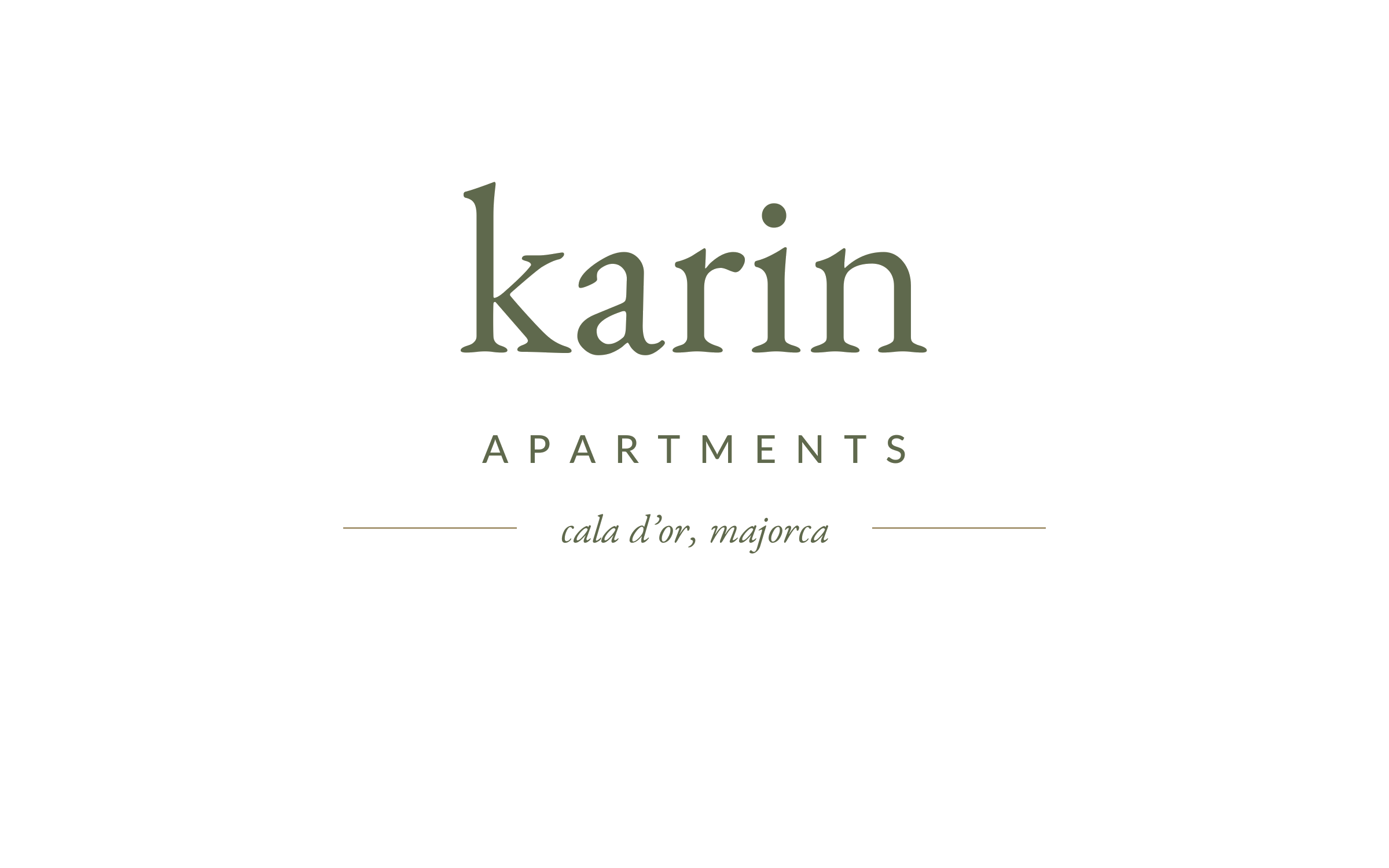
We redeveloped the logo.
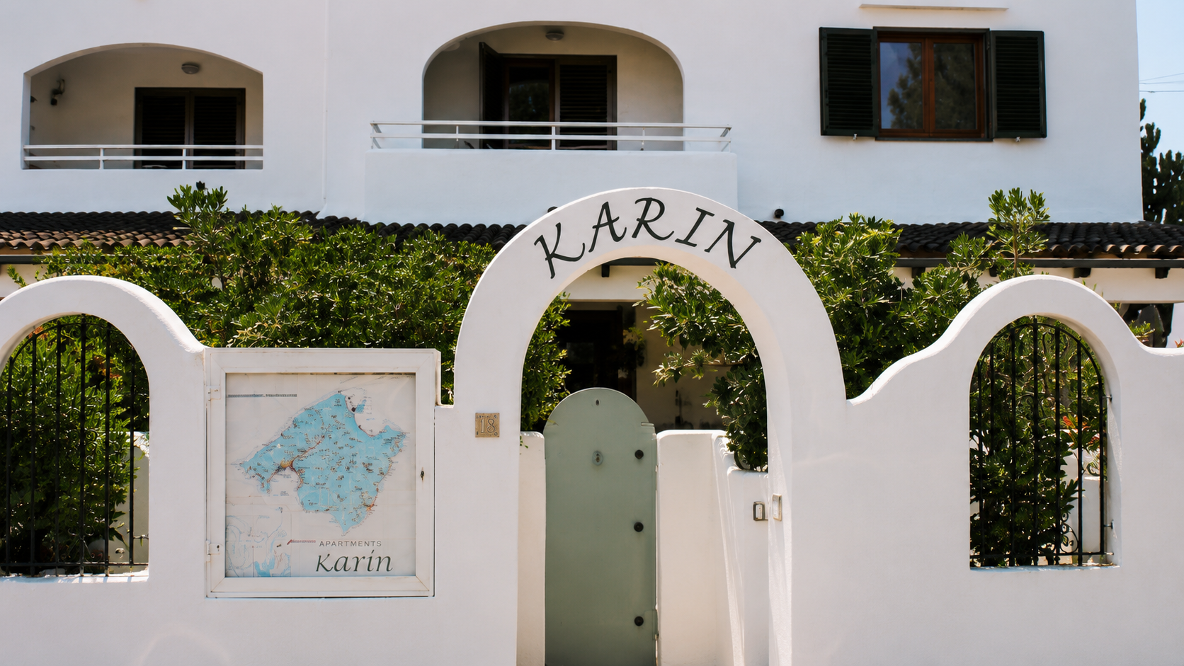
The original mark lived only on the garden wall: a single word, hand-painted, with no system around it. We redrew it into a proper lockup: a warmer serif, a hairline rule, and a place cue for Cala d'Or: enough of an identity to carry across signage, print, and the listing itself.
02: Print
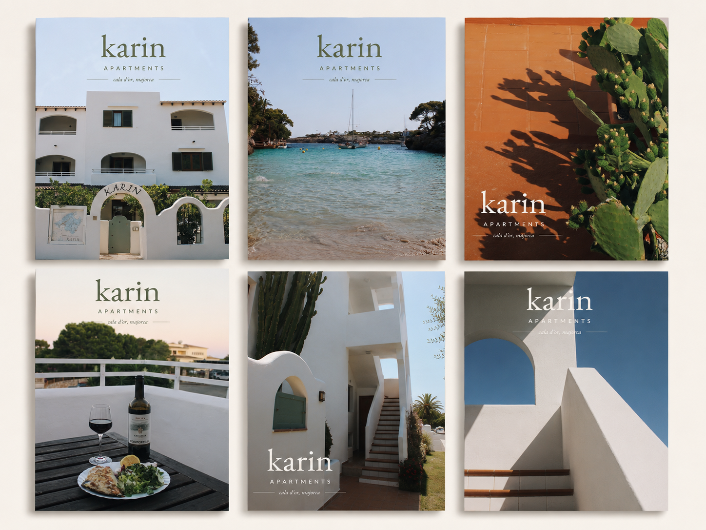
A postcard series.
Six postcards left in each apartment on arrival: a small welcome, a memento, and a subtle way for guests to hand the brand to a friend. Each one carries a different corner of the property or the cove next door.
03: Property
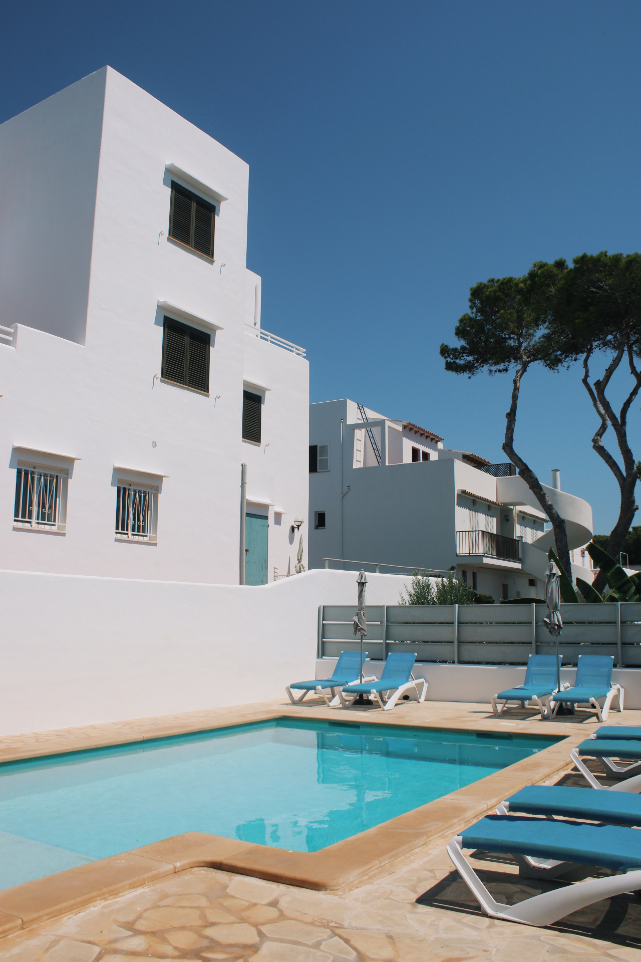
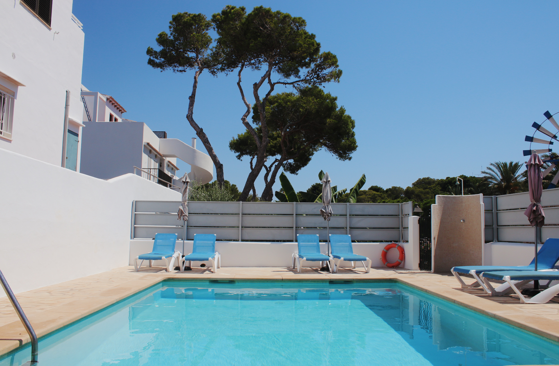
The pool, and the walk to the water.
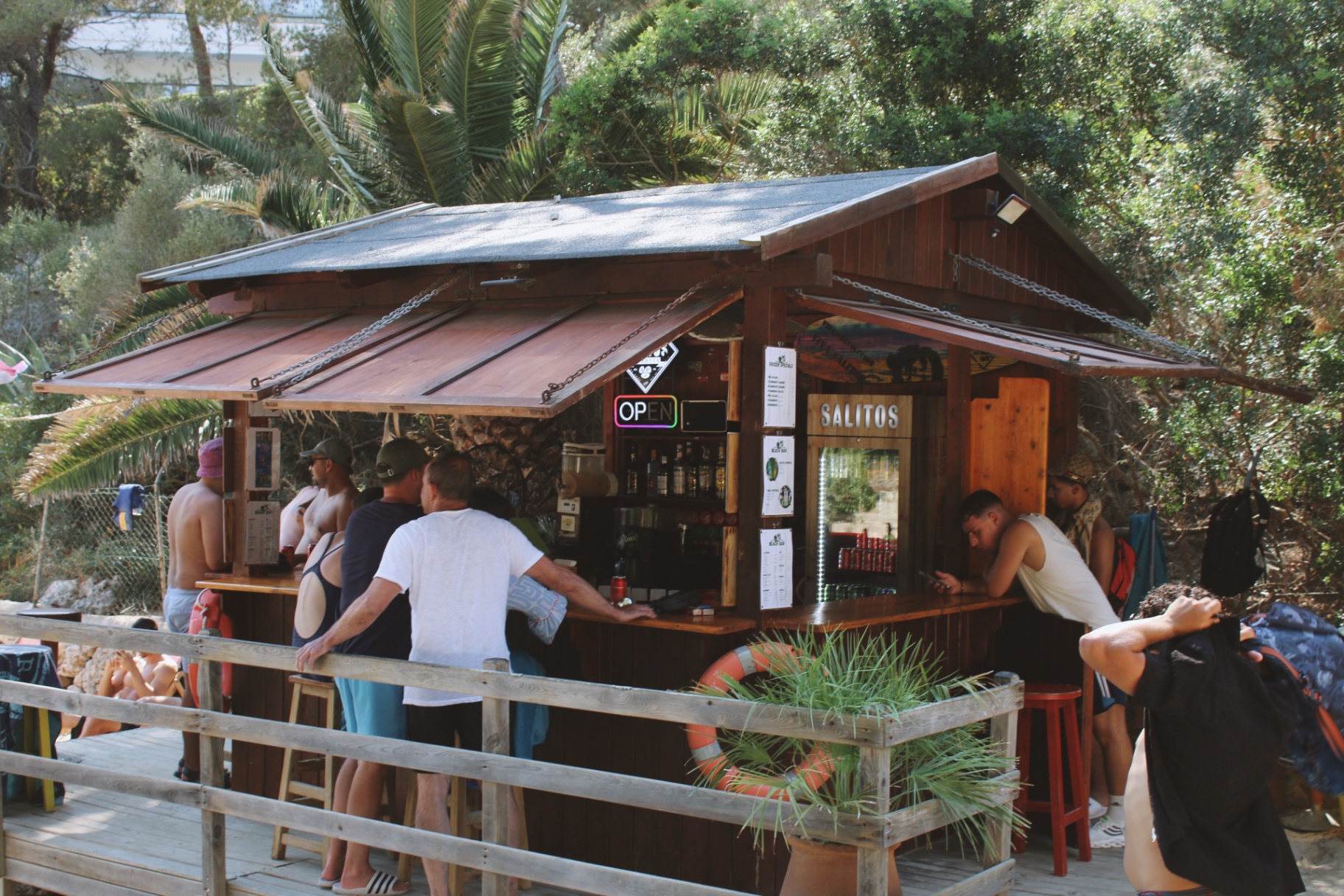
The listing under-sold two of its strongest assets: a quiet residents-only pool, and a five-minute path down the pines to Cala d'Or's swimming cove, complete with a beach bar at the sand. We reshot both, so the listing finally shows what guests actually arrive to.
Five minutes on foot
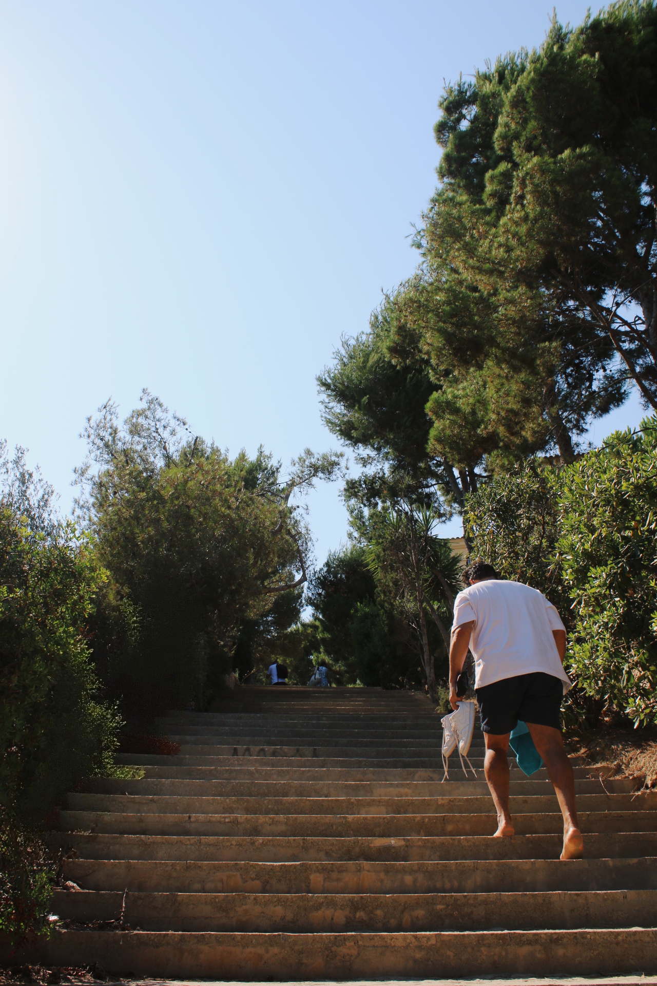
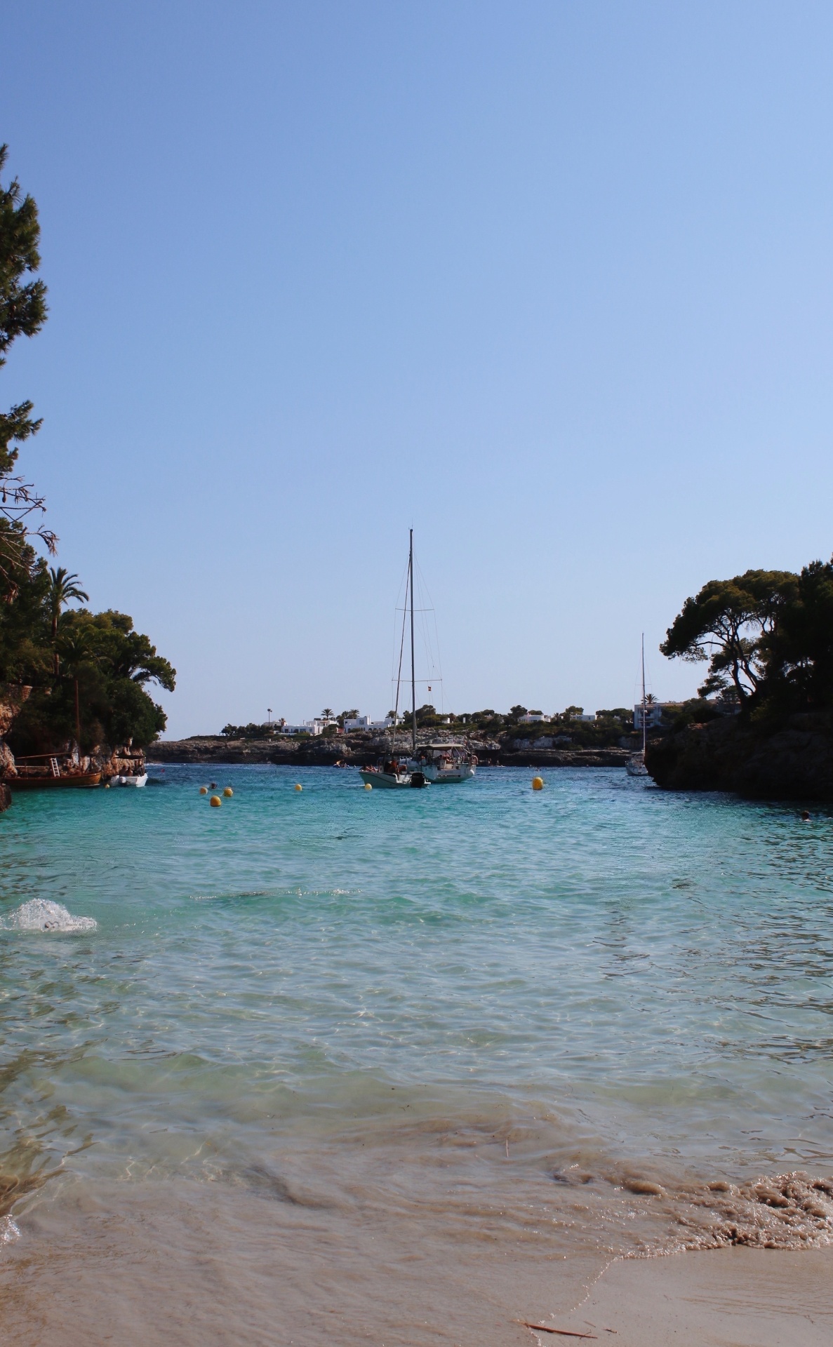
Steps to the water.
A shaded staircase runs from the property down through the pines to Cala d'Or's main swimming cove: turquoise, sandy, and moored with small sailboats by midday.
Companion visuals to the Listing Intelligence Audit: Case 03.